“Space: the final frontier. These are the voyages of the starship Enterprise. Its continuing mission: to explore strange new worlds, to seek out new life and new civilizations, to boldly go where no one has gone before.”
-Star Trek
From the early days of civilization, our greatest thinkers, astronomers, and mathematicians from Aryabhatta to Ptolemy and al-Khwarizmi to Fibonacci and others have looked to the stars for answers. Countless hours of pondering and looking skywards have given us key insights into our world and the universe.
From śūnya in Sanskrit to ṣifr in Arabic and eventually being commonly known as Zero, this mathematical paradox has come a long way. The number 0 fulfills a central role in mathematics as the additive identity of the integers, real numbers, and many other algebraic structures. And yet, simply put, it means nothing. How intriguing is that?
At Divide By Zero, we are drawn to the idea of Zero. Every new idea begins with a zero and has infinite possibilities when divided by it. As avid Star Trek fans, we look forward to boldly go and explore these possibilities.
From a humble garage project to one of India’s leading manufacturers of industrial-grade 3D printers, we have come a long way since our inception nearly 4 years ago. Together with our highly-skilled and growing team, we have created a homegrown brand now synonymous with high-quality, dependable and robust 3D printing solutions for clients from various industries and verticals.
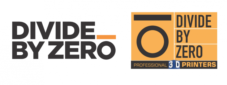
As part of our continuous improvement process, we are pleased to unveil our new look and brand identity. While the core elements are largely the same, the new design is in sync with our current ethos – Young, Energetic & Bold.
Deciphering Divide By Zero’s New Look
“Change is inevitable, but growth is optional”
-John C. Maxwell
Change certainly is inevitable and at Divide By Zero, we prefer embracing it with arms wide open. Over the last few years, our starship Enterprise has evolved into a Millennial Falcon, get it? Jokes and geeky puns aside, our company and workforce has changed and so has our outlook on things. We are not your run-of-the-mill machine manufacturing company. We are creators, disruptors, and innovators with a healthy dosage of geeky goodness and we wanted our logo to emanate that.
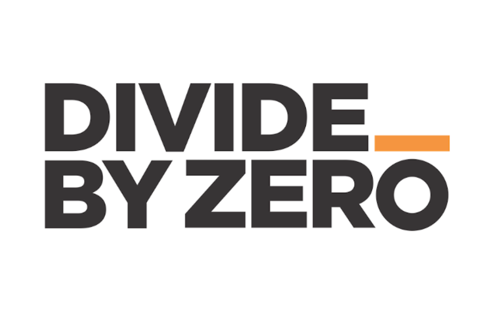
Simplicity and boldness are key aspects of this logo and our brand. The bold industrial orange prompt ( _ ) is designed to grab attention much like our innovative products and designs. It also represents the geekiness of our team. It is a precursor to what’s to come and an indication that something exciting is always brewing at the Divide By Zero labs.
The striking geometric font (Gotham) oozes the simplicity and boldness of our brand. The white, black, and orange with a stark contrast showcase the young, energetic, and bold image of our company. While we hate pointing the obvious, the orange prompt is strategically located above the O to denote our brand name, Divide By Zero.
Overall, we are extremely pleased with the new look and logo that is graced with a minimalistic design approach. The new logo perfectly captures what our products stand for – bold designs that simplify key challenges faced by our clients and customers.
The new design will slowly make its presence felt across our products and communication in the subsequent month. In the meanwhile, what do you think about our new design? Use the comment section below to share your thoughts, ideas, and suggestions.
Until the next time, live long and prosper.